PLN — Dynamism and Movement
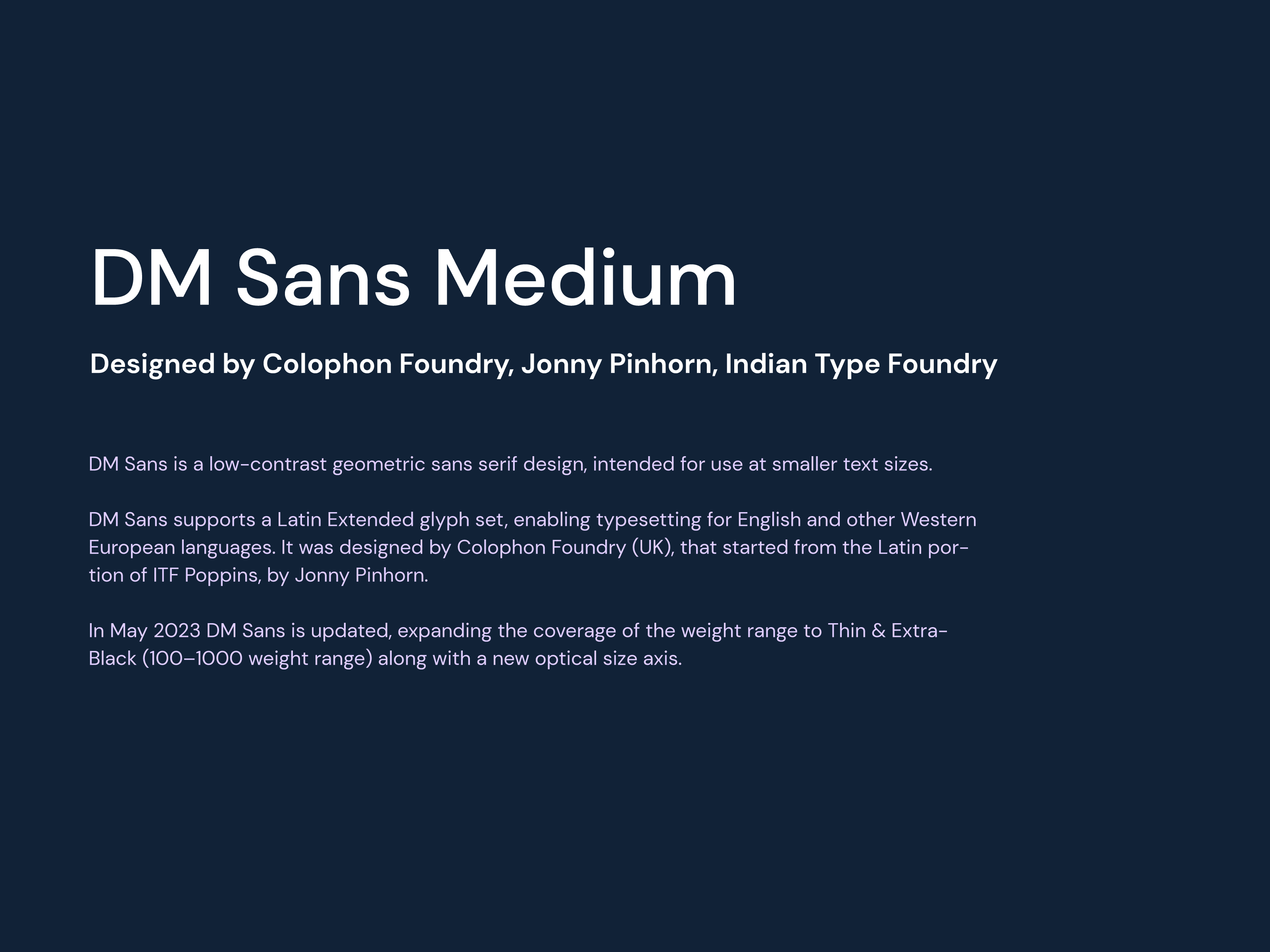
The design is executed in a simple and minimalist manner, featuring sans-serif typography to enhance the sensation of order and seriousness.
Branding — Naming


About the project
PROJECT AVAILABLE FOR SALE
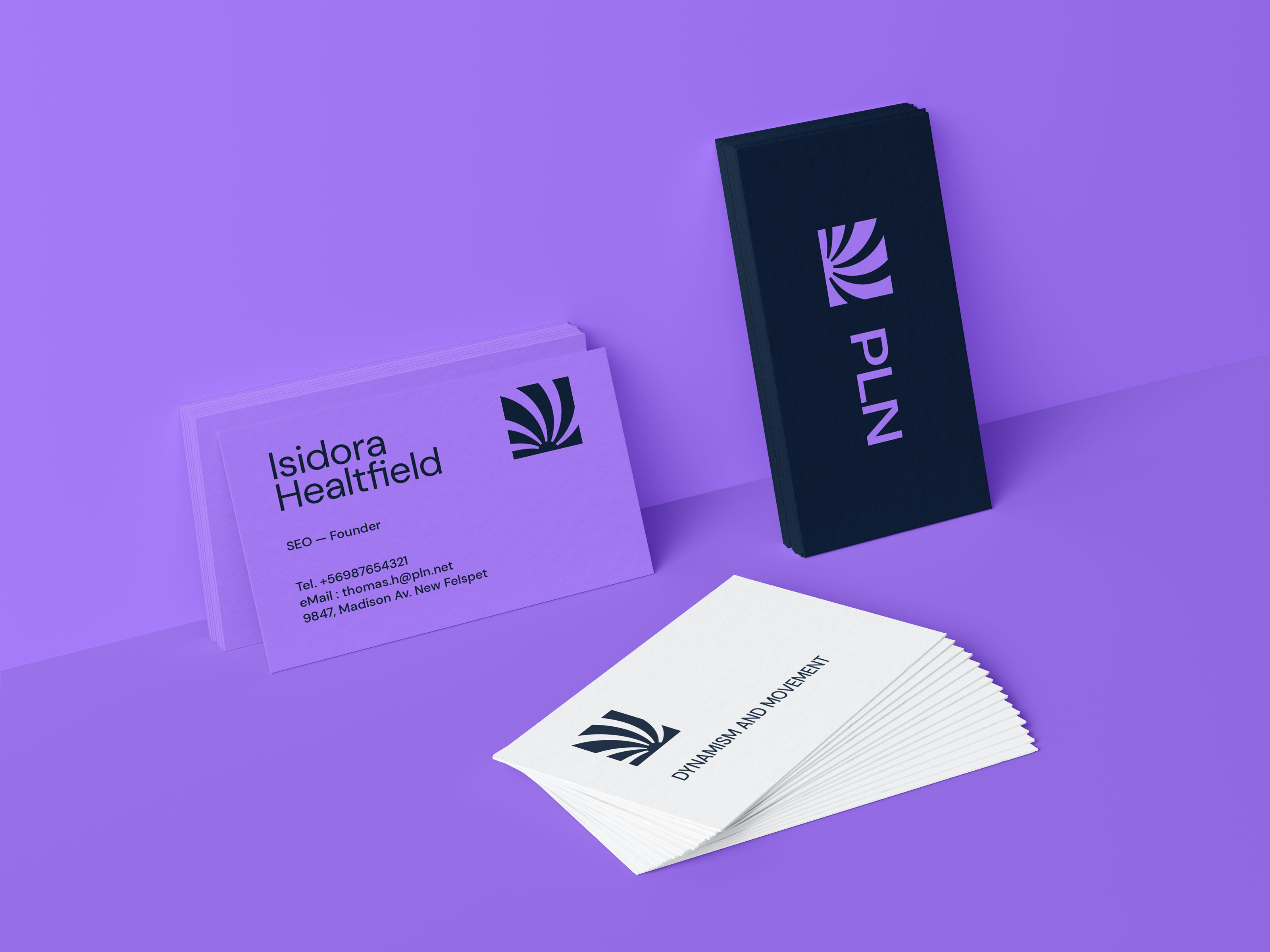
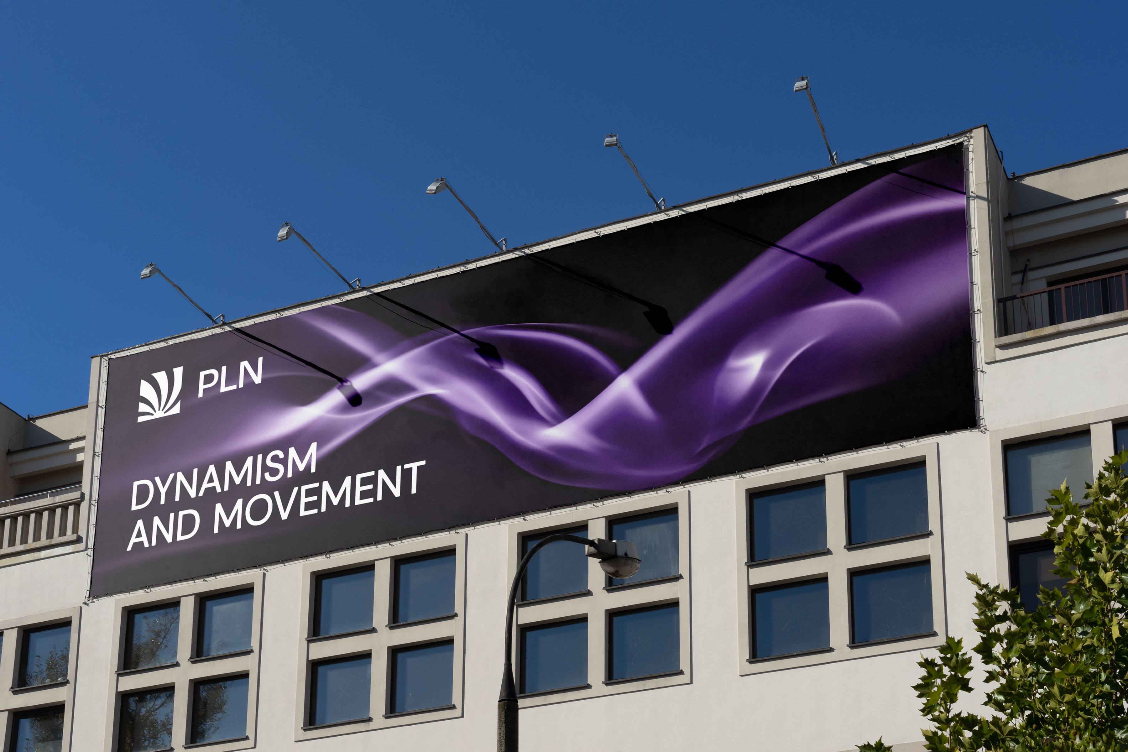
The brand's concept is centered around a focal point, using energy expansion in speed and circular movement within a square shape, creating an idea of order from chaos. The design is executed in a simple and minimalist manner, featuring sans-serif typography to enhance the sensation of order and seriousness. The strategic use of violet colors symbolizes energy, while blue is employed to represent order and professionalism. The carefully selected color palette ensures legibility and contrast, promoting a visually appealing and cohesive brand identity.
Watch at Behance


The focal point and energy expansion in the logo design evoke a sense of dynamism and forward movement. The circular motion within the square shape creates a balanced and structured impression, reflecting the idea of order emerging from chaos. By opting for a minimalist approach, the brand communicates a clear and uncluttered message, enhancing the perception of organization and seriousness.


The color scheme plays a crucial role in the brand's functionality. The violet hues exude a vibrant energy, captivating the audience's attention, while the use of blue instills a sense of trust and professionalism. These carefully selected colors are not only visually appealing but also contribute to legibility and contrast, ensuring that the brand's message is easily conveyed and understood.


In summary, the brand's visual identity embodies a harmonious blend of functional colors and shapes. The focal point and circular movement within the square create a dynamic visual appeal, representing order emerging from chaos. The simple and minimalist design, coupled with sans-serif typography, reinforces the notion of organization and seriousness. The strategic use of violet and blue colors enhances the brand's energy and professionalism, while ensuring readability and contrast for an effective and impactful presentation.
