Contandem
Logistics chilean company.
Branding

About the project
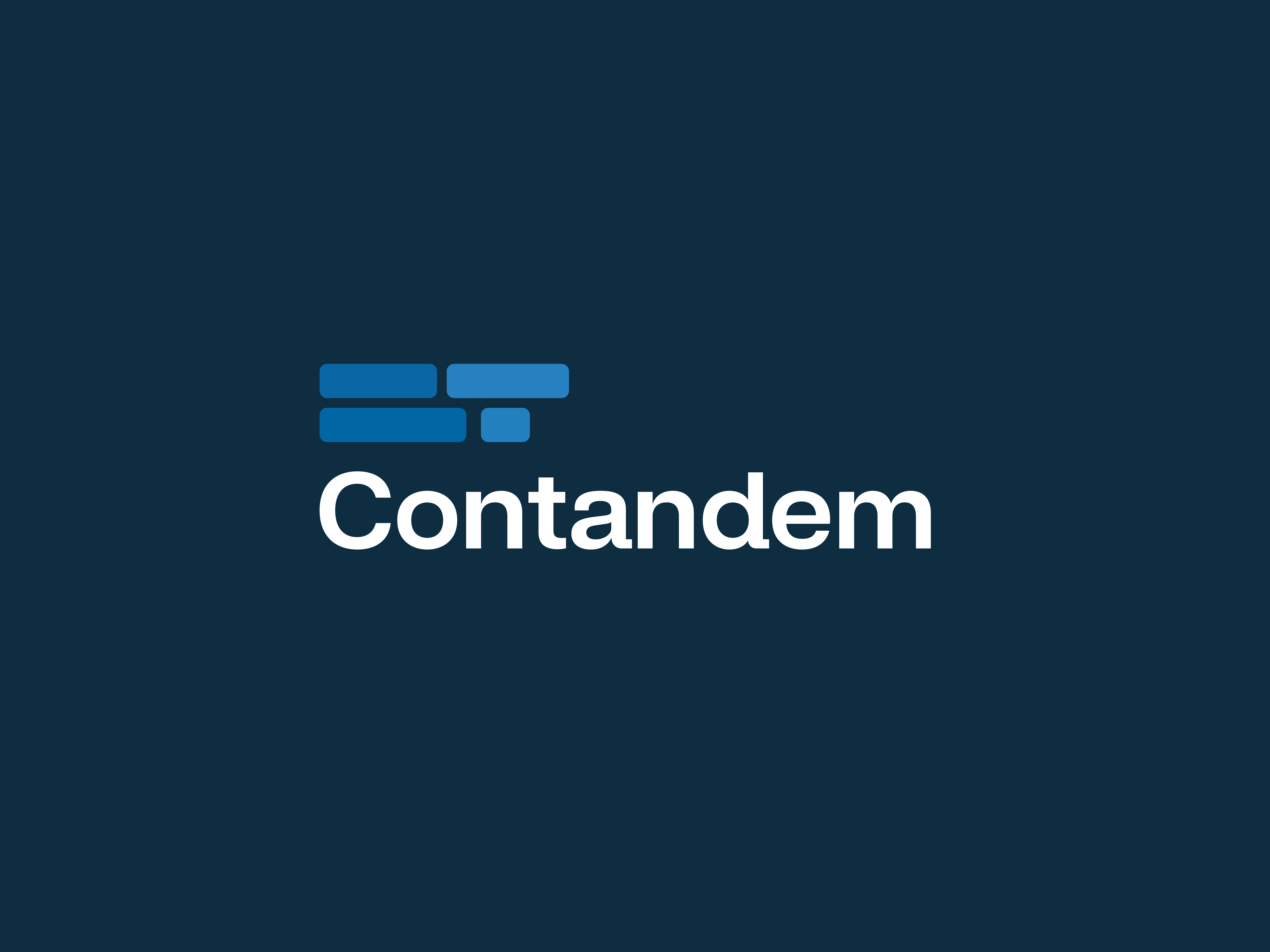
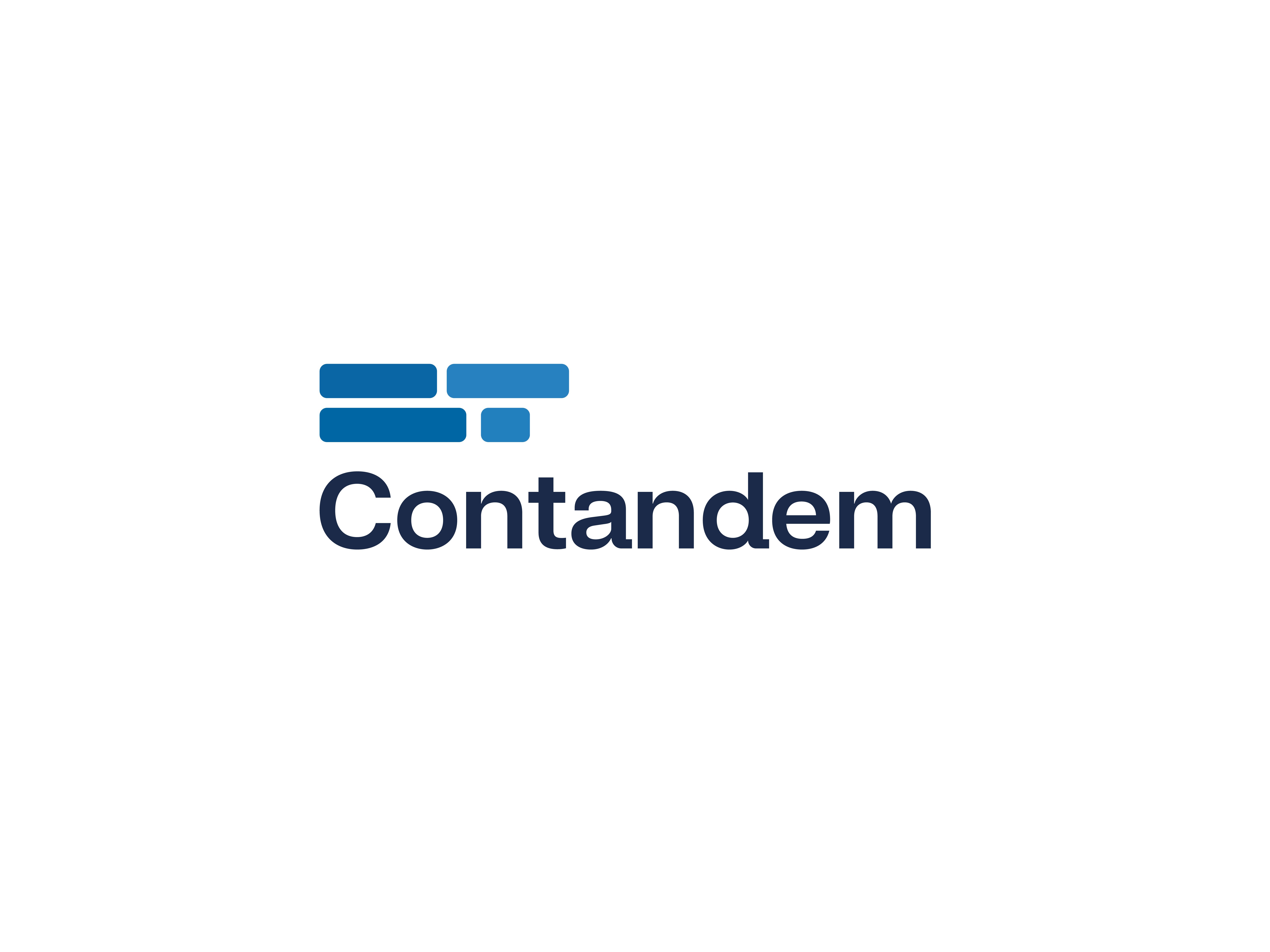
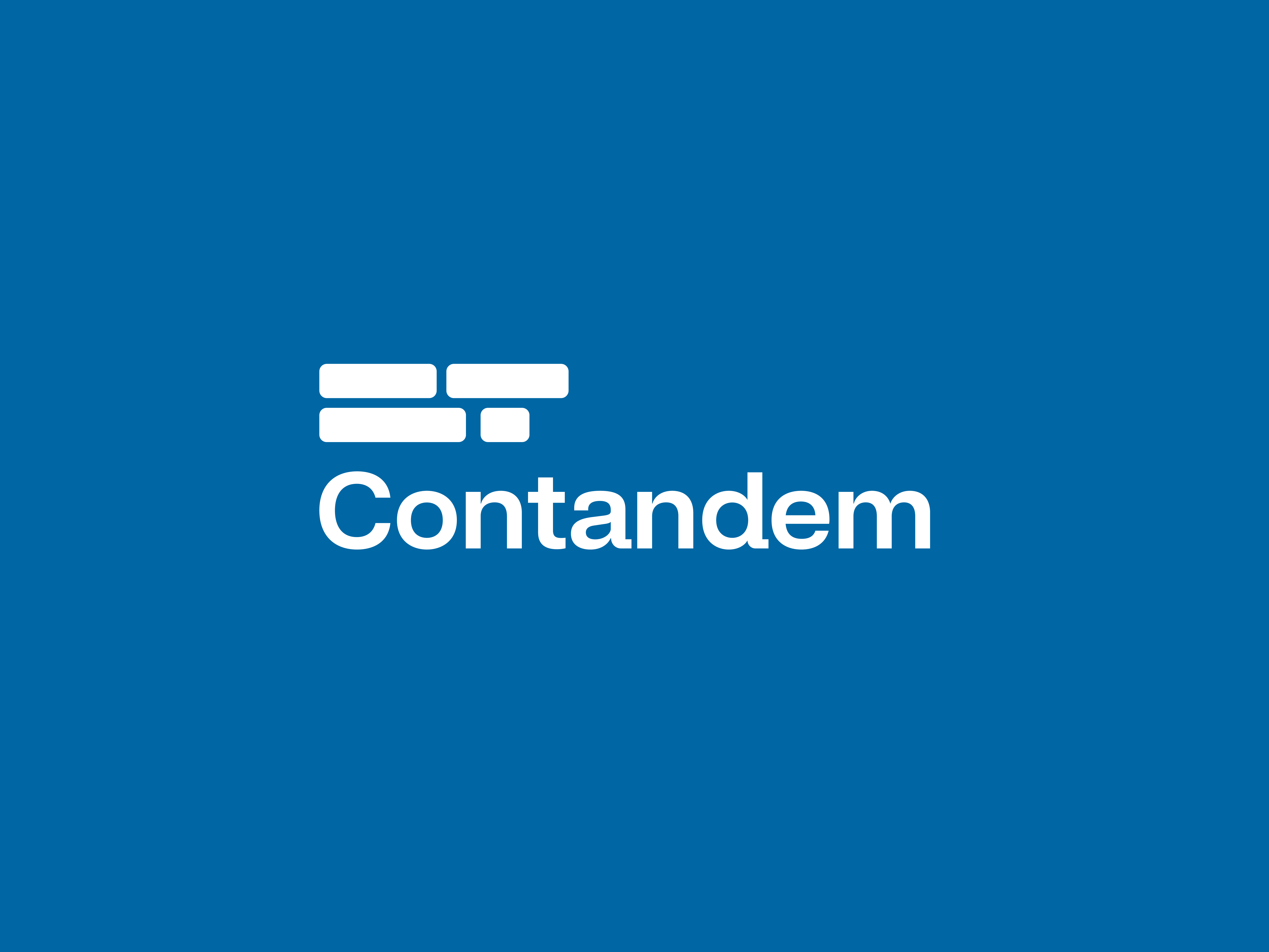
The graphic branding design for Contandem is based on the concept of stacked containers, symbolizing the essence of the company and its business area related to logistics and transportation. The use of stacked containers in the brand symbol creates a visually powerful and recognizable image, conveying the idea of solidity, efficiency, and order.
Branding — Naming
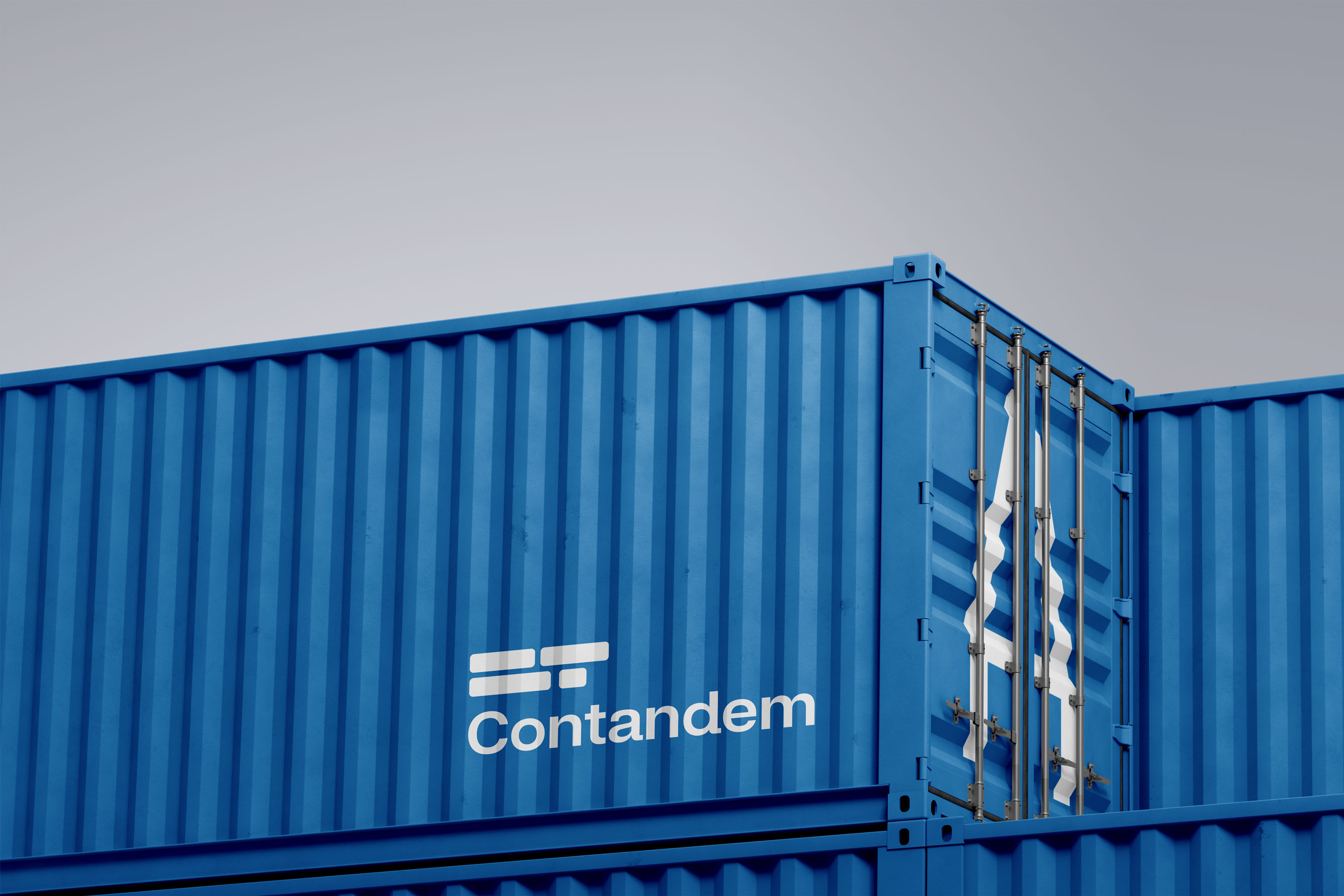

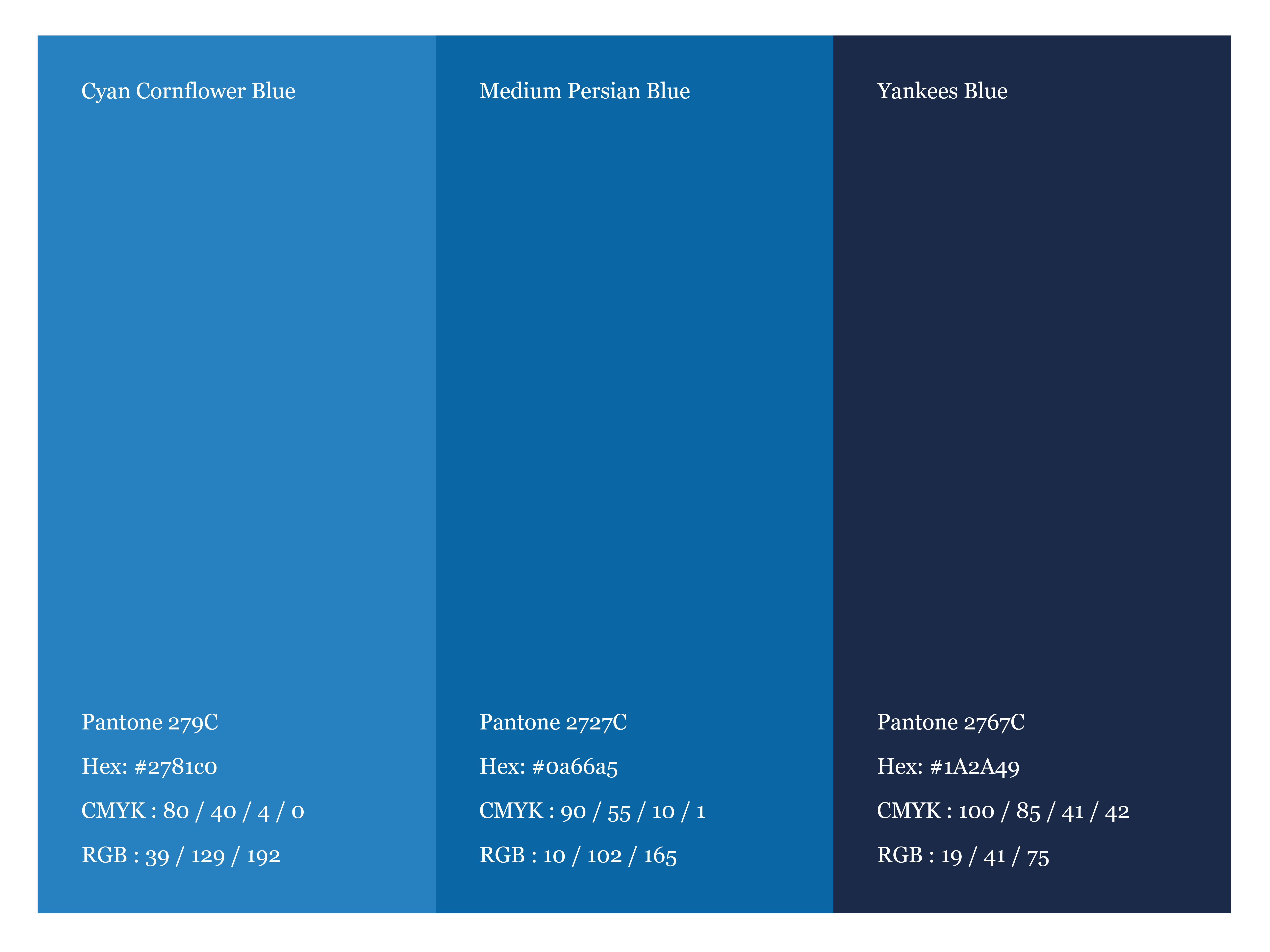
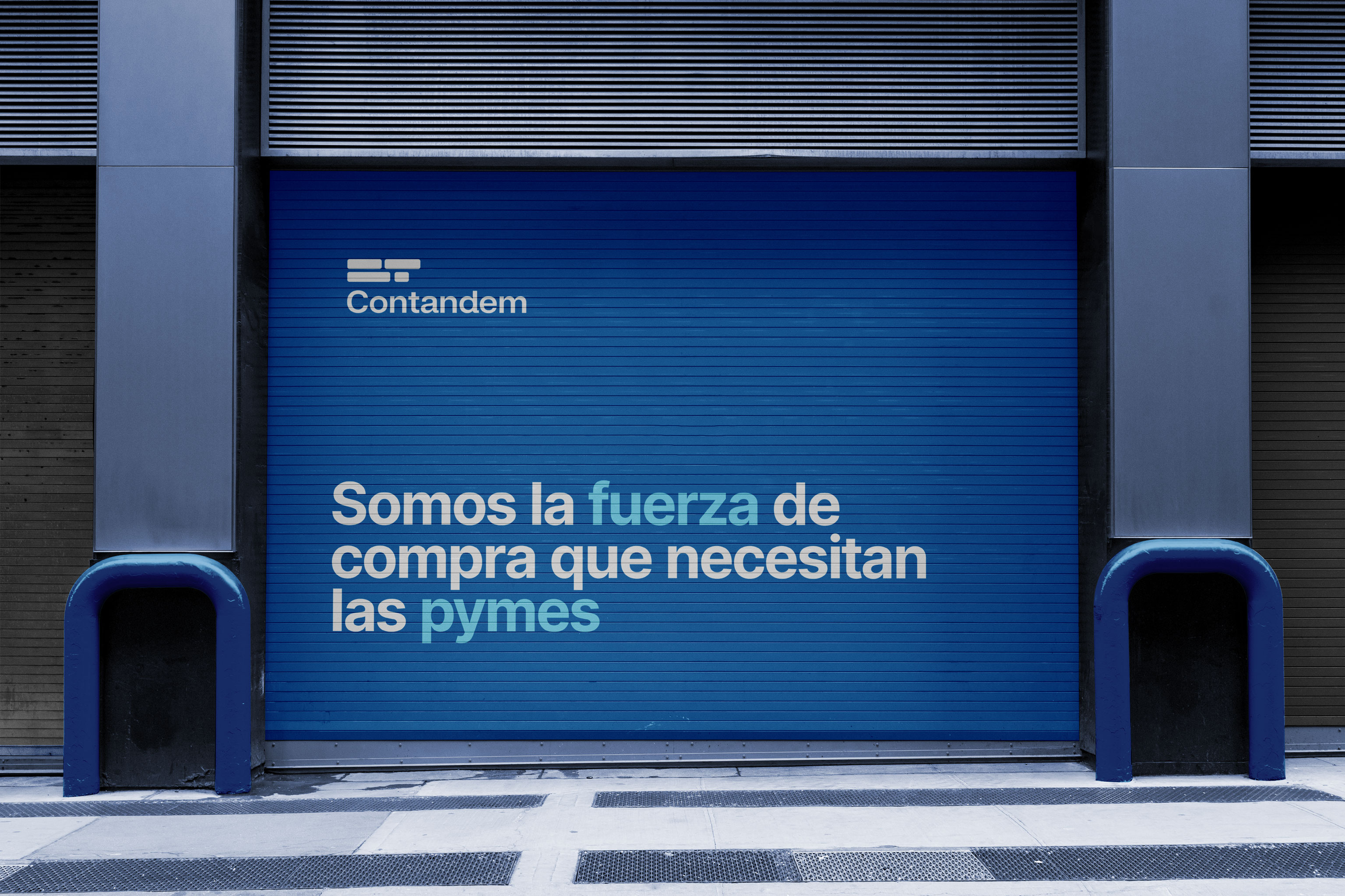
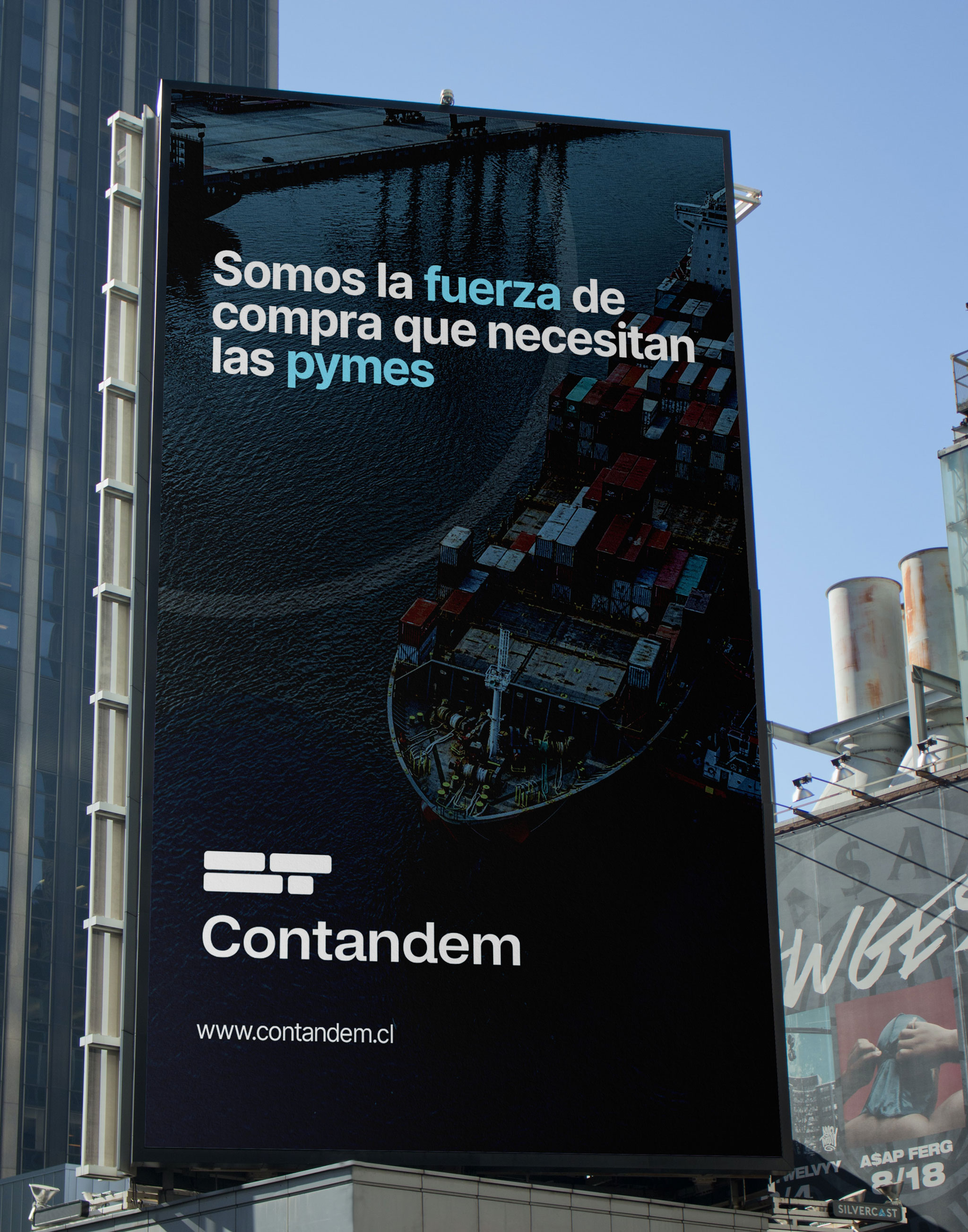
As for the colors, neutral blue tones have been chosen to represent Contandem's business area. Blue is a color that evokes trust, professionalism, and stability, which are highly valued characteristics in the logistics sector. These tones also convey a sense of seriousness and solidity, giving the brand a strong and reliable corporate image.
La colaboración fue sumamente cómoda, gracias a la eficacia y precisión de Alex en cuanto a los cambios y sugerencias. Recomendamos sus servicios ampliamente para aquellos que busquen una solución completa y guiada. Estamos encantados con nuestro nuevo logo y su significado. Sin lugar a dudas, continuaremos confiando en Alex para proyectos futuros.